Let me start by asking you to imagine two identical studio apartments, each measuring exactly three hundred square feet. They have the same dimensions, the same window placement, the same amount of natural light. Yet when you walk into the first apartment, you immediately feel cramped and claustrophobic. The space seems to close in around you, and you find yourself wanting to leave almost as soon as you enter. When you walk into the second apartment, something remarkable happens. Despite being exactly the same size, this space feels open, comfortable, and surprisingly livable. You can breathe easily here. You can imagine yourself living here happily. What creates this dramatic difference in how these identical spaces feel? The answer lies in something designers and environmental psychologists call flow, and understanding how to create it can completely transform your experience of living in a small space.
Flow in spatial design refers to how easily your eyes, your body, and your attention can move through a space without encountering obstacles, visual clutter, or confusing arrangements. Think of flow like water running through a streambed. Water flows smoothly when the channel is clear and well-shaped, but it backs up and becomes turbulent when it encounters obstacles and constrictions. Your experience of a space works similarly. When the arrangement allows smooth visual and physical movement, the space feels larger and more comfortable than its actual dimensions suggest. When the arrangement creates obstacles and interruptions, even a reasonably sized space can feel cramped and stressful. The fascinating part is that creating good flow has less to do with how much furniture you have or how much you spend, and much more to do with understanding a few key principles about how your brain processes spatial information. Once you understand these principles, you can apply them to transform even the tiniest apartment into a space that feels good to inhabit.
How Your Brain Creates the Experience of Space
Before we can talk about creating better flow in small spaces, you need to understand something fundamental about how spatial perception works in your brain. You might think that the size you experience when you enter a room is simply an objective measurement that your brain accurately registers, much like a tape measure records dimensions. This seems obvious, but it turns out your subjective experience of spatial size is actually a sophisticated mental construction that your brain builds from multiple sources of information, and that construction can be influenced in surprising ways. Your brain does not just passively record the dimensions of a room. Instead, it actively interprets various cues to create your experience of how large or small the space feels, and you can deliberately arrange these cues to influence that experience in your favor.
Let me explain the main factors your brain uses to construct its sense of spatial size. First and most obviously, your brain processes the actual physical dimensions by comparing the angles at which walls meet your field of vision and calculating how far away surfaces appear. This geometric information provides the foundation for spatial perception. However, your brain also weighs many other factors that can either amplify or diminish your sense of spaciousness. How far can you see before your sightline encounters an obstacle? Your brain interprets longer sightlines as indicating larger spaces, which is why an open floor plan feels more spacious than the same square footage divided into small rooms. How easily can you imagine moving through the space? Your brain constantly simulates potential movements, and spaces that allow easy imagined movement feel larger than spaces where movement appears constrained or complicated. What is the visual complexity of the environment? Spaces with visual clutter and competing elements feel smaller because your brain must work harder to process all the information, creating a sense of mental crowding that translates into perceived physical crowding.
This explains why two rooms of identical size can feel dramatically different based on how they are arranged and furnished. Your brain is not lying to you or making mistakes in these situations. It is doing exactly what it evolved to do, which is creating a useful subjective experience from available information. The practical implication is powerful. Since your experienced sense of spaciousness depends partly on factors you can control through arrangement and design choices, you can make a small space feel significantly larger without actually changing its dimensions. This is not about tricks or illusions that fool your brain in some superficial way. Rather, it is about understanding what your brain is looking for when it assesses spatial size, and then providing those signals through thoughtful layout decisions.
The Sightline Principle: Why What You See Matters More Than What You Have
Here is one of the most important principles for creating flow in small spaces, and it is something that most people do not intuitively understand until it is explained to them. When you enter a room or look up from what you are doing, your brain immediately assesses how far it can see in various directions before encountering visual obstacles. This assessment happens in milliseconds, largely outside conscious awareness, but it profoundly influences your sense of how large the space feels. A room where you can see all the way to the far wall from the entrance feels larger than a room where your sightline immediately hits a piece of furniture or a dividing element, even if the second room actually has more total square footage. Your brain essentially uses visual reach as a proxy for spatial size. The farther you can see, the larger the space must be, or so your brain reasons. This means that one of the most effective strategies for making a small space feel larger involves arranging furniture and other elements to maximize sightlines rather than blocking them. When you walk into your space, you want to be able to see as far as possible before your view encounters an obstacle. We will explore specific techniques for achieving this throughout this article, but understanding this core principle helps you evaluate layout decisions with the right framework.
Visual Flow Versus Physical Flow
When designers talk about flow in a space, they are actually referring to two related but distinct concepts that both matter for how the space feels. Let me explain each one so you understand the difference and can think about both when planning your layout. Visual flow refers to how easily your eyes can move through the space without encountering jarring interruptions, confusing arrangements, or overwhelming clutter. Think about the last time you walked into a space that felt visually calm and organized. Your eyes could rest comfortably, taking in the environment without strain or confusion. That experience reflects good visual flow. Now think about a space that felt chaotic or overwhelming. Your eyes probably jumped from object to object, never quite settling, as your brain tried to make sense of competing visual information. That discomfort reflects poor visual flow.
Physical flow refers to how easily your body can actually move through the space to accomplish daily activities. This involves having clear pathways between different areas, adequate room to perform tasks like opening drawers or sitting down, and logical positioning of furniture relative to how you actually use your space. Good physical flow means you can move from your bed to your kitchen to your work area without having to squeeze past obstacles, rearrange furniture, or perform complicated navigation. You can carry items from one area to another without putting them down multiple times to clear pathways. You can open closets and cabinets fully without furniture blocking them. These practical considerations might seem obvious, but you would be surprised how often people arrange small spaces in ways that create frustrating physical obstacles simply because they did not think through their actual movement patterns before placing furniture.
The interesting part is that visual flow and physical flow often work together synergistically. Arrangements that create good visual flow, with clear sightlines and organized visual hierarchies, tend to also support good physical flow because they reflect thoughtful spatial organization. However, the two types of flow can sometimes come into conflict, particularly in very small spaces where you might be tempted to sacrifice physical comfort for visual openness or vice versa. Learning to balance these two considerations while prioritizing the one that matters most for your particular space and lifestyle represents an important skill in small space design. Throughout this article, I will point out when recommendations primarily serve visual flow versus physical flow so you can make informed decisions about trade-offs when necessary.
The Foundation: Understanding Your Actual Space
Before you can create good flow in your small space, you need to really understand the space you are working with, and I mean understanding it at a deeper level than just knowing its dimensions. Most people have a general sense of their apartment’s layout, but they have never carefully analyzed the specific characteristics that will influence how flow works in their particular space. Taking time to do this analysis before moving or rearranging furniture will save you enormous frustration and help you make decisions that actually work for your specific situation rather than just copying generic small space advice that might not fit your reality.
Mapping Your Movement Patterns
Start by spending a few days paying careful attention to how you actually move through your space during typical daily activities. In the morning, what route do you take from bed to bathroom to kitchen? When you come home with groceries, where do you enter and where do you need to go? When you are cooking, do you move back and forth between refrigerator, stove, and counter in a logical sequence or do you find yourself crossing the same space multiple times because things are poorly positioned? When you clean, what path makes sense for moving through different areas? These movement patterns represent your physical flow requirements, and your furniture arrangement should support them rather than obstruct them. You might even try drawing a simple map of your space and sketching the paths you take most frequently throughout the day. This exercise often reveals surprising insights about which areas see heavy traffic and which areas are rarely used, information that should inform your layout decisions.
As you observe your movement patterns, pay special attention to any moments of frustration or awkwardness. Do you have to turn sideways to squeeze past your couch to reach your desk? Do you bump into the coffee table constantly when moving between your sitting area and kitchen? Does opening your closet door require you to move something else first? These friction points indicate where your current layout is fighting against your natural physical flow. Write them down, because addressing these specific problems should become priorities in your layout optimization. Often, solving just two or three major friction points can dramatically improve how a space feels to live in, even if you make no other changes.
Identifying Your Visual Anchor Points
Now let us think about visual flow by identifying what I call visual anchor points in your space. These are the first things your eyes land on when you enter your space or look up from an activity. Stand at your entrance and notice where your eyes naturally go. What do you see first? What draws your attention? Now sit in your most-used sitting area and do the same assessment. What dominates your visual field from this position? These visual anchor points matter enormously because they set the tone for your experience of the space. If your anchor points are cluttered surfaces, awkward furniture arrangements, or ugly necessities like your trash can, your space will feel chaotic and unpleasant even if the overall layout is reasonable. If your anchor points are pleasant views, well-organized elements, or visually calm areas, your space will feel more comfortable and appealing.
Think about how you can improve your anchor points through strategic arrangement. Can you position furniture so the first thing visible from your entrance is an appealing view rather than a cluttered desk? Can you use attractive storage or decorative elements to create visual interest in the spots your eyes naturally rest on? Can you ensure that from your most-used positions, like your bed or couch, you are looking at something pleasant rather than something purely functional or messy? These adjustments cost nothing beyond some thoughtful rearranging, yet they can substantially improve your daily experience of your space by shaping what you see most often during the activities that fill your days.
Core Principles for Creating Visual Flow
Now that you understand how spatial perception works and have analyzed your specific space, let me walk you through the fundamental principles that create good visual flow. These principles apply regardless of your space’s specific dimensions or layout, though how you implement them will vary based on your situation. Think of these as the underlying rules that guide all your specific decisions about furniture placement, color choices, and organization strategies.
The Longest Diagonal Principle
Here is a principle that professional designers use constantly but that most people never consciously consider. Every rectangular space has a longest diagonal line running from one corner to the opposite corner. This diagonal represents the maximum possible sightline length within your space. When you arrange furniture to preserve visibility along this longest diagonal or at least major portions of it, your space will feel significantly larger than if you interrupt this sightline with visual obstacles. Let me give you a concrete example to illustrate this principle. Imagine a rectangular studio apartment where the entrance is at one corner. If you place a bookshelf or room divider perpendicular to the long wall about halfway through the space, you cut the longest diagonal sightline in half. When you enter, you can only see to that divider, and your brain registers the space as small. Now imagine instead placing that same bookshelf along one of the longer walls, leaving the diagonal open. Suddenly when you enter, your eye can travel all the way to the far corner, and the space feels dramatically more open even though you have the same amount of square footage and the same furniture.
Implementing this principle requires you to think carefully about where you place your tallest or most visually substantial pieces of furniture. These pieces have the greatest potential to block sightlines and make your space feel cramped. Whenever possible, position these larger items along walls rather than floating them in the space in ways that interrupt visual flow. If you need to divide your studio into sleeping and living areas, for example, consider whether you can use a low divider that preserves some sightline visibility over it, or position a full-height divider parallel to your longest diagonal rather than cutting across it. These small positioning decisions, informed by understanding how sightlines affect spatial perception, can make the difference between a space that feels cramped and one that feels surprisingly open.
Visual Weight Distribution
Different objects and design elements carry what designers call visual weight, which refers to how much they draw your attention and how heavy or substantial they appear in the visual field. Dark colors carry more visual weight than light colors. Large solid masses carry more weight than delicate or transparent pieces. Busy patterns carry more weight than simple surfaces. When you are working with a small space, you need to think strategically about how you distribute this visual weight to avoid overwhelming the space or creating imbalance that makes it feel uncomfortable. Think about it this way. If you cluster all your visually heavy elements in one area, like having a dark heavy sofa, a large solid coffee table, and a big entertainment center all grouped together, that area will feel very dense and weighty while other parts of your space might feel empty by contrast. This imbalance creates visual discomfort and makes the space feel smaller because the heavy area seems to pull all the visual energy into one tight zone.
Instead, aim to distribute visual weight relatively evenly throughout your space. This does not mean everything should be exactly the same weight or that you cannot have any visually substantial pieces. Rather, it means balancing heavier elements with lighter ones in ways that create harmony. If you have a substantial sofa along one wall, balance it with lighter elements like open shelving or a delicate side table on the opposite side of the space. If you need dark-colored storage in one area, use lighter colors in adjacent areas to prevent the darkness from feeling overwhelming. If you have busy patterned textiles in your sleeping area, keep your living area more visually simple. This balanced distribution of visual weight helps your eye move comfortably through the space without getting stuck on any one area, which supports the sense of flow we are trying to create.
The Power of Empty Space
This principle often proves counterintuitive for people living in small spaces, but it is absolutely crucial for creating good flow. Empty space, what designers call negative space, is not wasted space that you should fill with more furniture or storage. Rather, empty space serves essential functions in making your overall space feel larger and more comfortable. Your brain needs places where your eyes can rest without processing objects or information. These visual resting places create a sense of calm and spaciousness that becomes impossible when every surface and area is filled with things. Additionally, empty floor space creates the illusion of larger total square footage because your brain essentially counts visible floor area as part of its spatial calculation. The more floor you can see, the larger the space feels, even if that floor is serving no particular function beyond being visible.
I understand that embracing empty space feels difficult when you have limited square footage and many things you need to store and accommodate. The instinct is to fill every possible spot with functional elements. However, I encourage you to resist this instinct and instead preserve at least some empty zones in your space. This might mean leaving some wall space blank rather than hanging shelves everywhere. It might mean keeping your coffee table surface clear rather than using it as storage for books and remotes. It might mean choosing a smaller couch that leaves more visible floor space rather than a larger one that fills the entire seating area. These decisions create trade-offs, certainly, but the payoff in terms of how much more spacious and calm your space feels often justifies some sacrifice in total storage or furnishing. The key is being strategic about which empty space you preserve, focusing on areas that are visible from your main vantage points and along your primary sightlines, while allowing yourself to fill less visible areas more densely if needed.
The Horizon Line Concept: Working With Eye Level
Let me introduce you to another powerful principle for creating visual flow in small spaces. When you stand or sit in a space, your natural eye level creates an invisible horizontal line around the room called the horizon line. Elements positioned along or near this horizon line receive much more visual attention than elements positioned significantly above or below it. This has important implications for small space design. If you place many items or create visual complexity right at eye level, your space will feel busier and more cluttered than if you keep the horizon line relatively clear and simple. Think about how this works in practice. Tall bookcases filled with objects all along their height create visual density at multiple levels, but especially at eye level where you notice them most. In contrast, low storage furniture keeps the eye-level horizon relatively clear even while providing substantial storage capacity below your natural sightline. When you are working with limited space, favoring lower furniture profiles and keeping surfaces at eye level clear and simple creates a much greater sense of openness compared to filling vertical space all the way up with visually busy elements. This does not mean you cannot use vertical space for storage, but it suggests being strategic about what you place where, keeping your most-used eye-level areas as calm and simple as possible.
Furniture Selection and Arrangement for Flow
Now let us get practical and talk about how you actually choose and arrange furniture to support the flow principles we have discussed. This is where theory meets reality, and where you will make the specific decisions that transform your small space from cramped to comfortable. The furniture you select and how you position it probably has more impact on flow than any other single factor, so this deserves careful thought rather than just defaulting to standard arrangements or using whatever furniture happens to be available.
Scale Matters More Than Style
When you are shopping for furniture for a small space, you might be tempted to focus primarily on style, looking for pieces that match your aesthetic preferences. While style certainly matters for your enjoyment of your space, I want you to understand that scale, meaning the size and proportions of furniture relative to your room size, matters even more for creating good flow. A beautiful oversized sectional sofa might look perfect in a showroom or a friend’s large living room, but in your small studio it will dominate the space and destroy flow no matter how lovely its design. Conversely, furniture that is appropriately scaled for your space will look and feel right even if its style is not your absolute favorite, because the proportions will work harmoniously with your room dimensions.
As a general rule for small spaces, look for furniture with smaller footprints and lower profiles. A loveseat or apartment-size sofa works better than a full-size three-seater sofa. A dining table for two or four works better than one designed to seat six. Low platform beds create more sense of vertical space than tall beds with massive headboards. The tricky part is that furniture stores often do not carry much truly small-scale furniture, because average homes have been getting larger over time and furniture has scaled up accordingly. This means you might need to shop more carefully, looking at pieces specifically designed for apartments or even considering vintage furniture from eras when homes were smaller and furniture was proportioned accordingly. Some contemporary brands specialize in space-saving designs, and learning to recognize these can help you make better choices. When in doubt about whether a piece will work in your space, measure carefully and use tape on your floor to mark out the footprint before purchasing. This simple step prevents the common mistake of buying furniture that technically fits but leaves no room for comfortable flow around it.
Creating Clear Zones Without Hard Divisions
One of the biggest challenges in studio apartments and other small spaces involves creating distinct functional areas for sleeping, living, working, and eating without using walls or full-height dividers that would destroy visual flow. Your brain actually wants some level of functional zoning. Research in environmental psychology shows that people feel more comfortable and function better when different activities have defined spaces, even when those spaces exist within one larger room. Complete openness with no zones at all creates ambiguity that most people find unsettling. However, the solution is not adding walls or barriers that chop up your limited space. Instead, you can create what designers call implied zones using furniture arrangement, rugs, lighting, and subtle level changes.
Let me walk you through how this works with a concrete example. Imagine you want to separate your sleeping area from your living area in a studio. Instead of putting up a curtain or bookshelf divider that completely blocks the view between zones, try positioning your bed with its headboard against a wall and placing a low open bookshelf perpendicular to the foot of the bed, extending partway into the room. This bookshelf creates a partial visual barrier that signals the bedroom zone without blocking sightlines completely. You can still see over and through the shelf from most angles, preserving that crucial visual flow. Add a rug under your bed that is different from the rug in your living area, and suddenly your brain registers two distinct zones even though they remain visually connected. Use different lighting in each zone, perhaps a floor lamp near your couch and a bedside lamp in the sleeping area, and the zoning becomes even clearer. These implied boundaries satisfy your brain’s desire for functional separation while preserving the open feeling that makes small spaces livable.
The Thirty-Six Inch Rule for Pathways
Here is a specific, practical guideline that will help you make furniture arrangement decisions that support good physical flow. Any pathway that you use regularly in your daily movement through your space should be at least thirty-six inches wide, measured from furniture edge to furniture edge or wall. This thirty-six inch minimum comes from both building codes for accessibility and from ergonomic research about human movement. Pathways narrower than thirty-six inches start to feel cramped and require you to turn sideways or squeeze through, creating that uncomfortable sensation of being constrained. Pathways wider than thirty-six inches feel comfortable and allow easy movement, contributing to the overall sense of flow. In spaces larger than studios, main pathways might ideally be even wider, but thirty-six inches represents the functional minimum for small space comfort.
When you are arranging furniture, consciously measure your pathways to ensure they meet this guideline. The main path from your entrance through your space should definitely be at least thirty-six inches clear. The path from your bed to your bathroom should meet this standard. The route you take when carrying dishes from your kitchen area to your dining area should have this clearance. Lesser-used pathways, like the space behind your couch if you rarely go there, can be somewhat narrower if necessary, but your primary circulation routes deserve this full clearance. Sometimes meeting this guideline requires you to position furniture closer to walls than you might initially prefer, or to choose a smaller piece of furniture than you wanted. These trade-offs are worth it, because comfortable pathways dramatically improve your daily experience of moving through your space. The frustration of constantly squeezing past furniture or having to move things to get by accumulates over time and makes a space feel oppressive even if it looks fine when you are sitting still.
Color, Light, and Material Choices
Beyond furniture arrangement, your choices about color, lighting, and materials significantly influence flow by affecting how your brain processes the visual information in your space. Let me explain how these elements work so you can make informed decisions that support the sense of spaciousness and calm you are trying to create. These choices might seem purely aesthetic at first glance, but they actually have measurable effects on spatial perception based on how your visual system processes different types of information.
The Light Color Advantage
You have probably heard the standard advice that light colors make small spaces feel larger, and this recommendation is not just design fashion but reflects real perceptual psychology. Let me explain why this works so you understand the principle rather than just following a rule. Light colors reflect more light than dark colors, which means they literally make your space brighter overall. This increased brightness has several effects. First, your pupils can remain more contracted in brighter environments, which increases your depth of field and allows you to see more of your space in clear focus simultaneously. Second, brighter spaces feel more open and less enclosed because brightness is associated with outdoor environments and openness in your evolutionary experience. Third, light colors on walls tend to recede visually, making walls appear farther away than they are, while dark colors advance and make walls appear closer. Fourth, light colors create less visual weight, reducing the sense of density in your space.
Now, understanding these principles does not mean you must paint everything white and only own beige furniture. Rather, it suggests using light colors strategically on your largest surfaces, particularly walls and major furniture pieces, while allowing yourself darker accents in smaller doses through accessories, artwork, or small furniture pieces. Think about creating a light background against which you can add pops of darker or richer color in ways that create interest without overwhelming the space. This approach gives you both the spatial benefits of light colors and the visual richness that makes a space feel personal and engaging. Many successful small space designs use a base palette of whites, light grays, or soft earth tones for walls and major pieces, then introduce deeper colors through textiles, artwork, and decorative objects. This strategy provides the best of both worlds.
Layered Lighting for Depth
Many small apartments rely primarily on a single overhead light fixture for illumination, and this represents a missed opportunity for creating better spatial flow. When your space has only one light source, particularly overhead, it tends to flatten the visual depth of the room. Everything receives relatively uniform illumination, which eliminates the shadows and variations in brightness that help your brain perceive three-dimensional depth and spatial extent. In contrast, using multiple light sources at different levels and locations in your space creates what designers call layered lighting, and this approach makes spaces feel larger and more interesting through the depth perception it supports.
Think about incorporating at least three types of lighting in your small space. Ambient lighting, which might come from your overhead fixture or from wall-mounted lights, provides overall illumination for the room. Task lighting, like a desk lamp or reading light, provides focused bright light for specific activities. Accent lighting, such as a small lamp that highlights a plant or artwork, creates visual interest and depth. When these different light sources work together, your space develops layers of brightness that create shadows, highlights, and variations in tone. These variations give your brain more depth cues to work with, making the space feel more three-dimensional and spacious than flat even lighting would. Additionally, being able to adjust your lighting by turning different sources on or off allows you to create different moods and apparent spatial configurations within the same physical space, adding another dimension of flexibility to your small environment.
Material Texture and Reflection
The materials you choose for furniture, window treatments, and decorative elements affect flow through their reflective properties and textures. Shiny or glossy surfaces reflect light and can make spaces feel brighter and more open by bouncing light around the room. This is why mirrors are such popular recommendations for small spaces. They reflect both light and the view of your space, essentially doubling the visual information and making the area appear larger. However, you need not limit yourself to actual mirrors. Other reflective materials like glass, polished metal, lacquered wood, or satin fabrics provide similar if less dramatic effects. Incorporating some reflective surfaces through your material choices helps amplify light and create a sense of airiness.
At the same time, having too many shiny surfaces can make a space feel cold and visually busy as light bounces around chaotically. Balance is important here, as with most design principles. You want enough reflective surfaces to amplify light and create brightness, but you also want some matte or textured surfaces that absorb light and provide visual rest. Soft textiles like throw blankets and cushions, natural wood with visible grain, woven baskets for storage, and matte paint finishes all contribute this light-absorbing quality. The ideal small space includes a thoughtful mix of both reflective and light-absorbing materials, creating visual interest through this variety while maintaining the overall brightness that makes the space feel open. When you are selecting materials, think about this balance and avoid going too far in either direction toward all shiny or all matte.
The Monochromatic Approach: When to Use It
You might have noticed that many beautifully photographed small spaces use what designers call a monochromatic or nearly monochromatic color scheme, where everything in the space exists within a narrow range of closely related colors. This approach definitely makes spaces feel larger and more cohesive, and I want to explain why so you can decide whether it is right for you. When your eye moves around a space with many different colors, your brain has to process each color change as a distinct piece of information. This processing creates visual complexity that can make a space feel busier and smaller. In a monochromatic space, your eye encounters less variation as it moves around, which means less processing work for your brain and a calmer, more unified feel. The space reads as one cohesive environment rather than a collection of separate elements. However, the trade-off is that monochromatic spaces can feel less personalized and can require more attention to texture and material variation to avoid appearing boring or sterile. Many people find completely monochromatic schemes too restricting. A middle ground that works well for many small spaces involves using a limited palette of two to three closely harmonious colors rather than either full monochrome or unlimited color variety. This limited palette provides enough unity to make the space feel cohesive and calm while allowing enough variation to create interest and express personality.
Practical Layouts for Common Small Space Configurations
Now let me get very practical and walk you through layout strategies for the most common types of small spaces. While every apartment has unique characteristics, most fall into a few standard configurations, and understanding good approaches for each type will help you adapt these principles to your specific situation. As I describe these layouts, pay attention to the underlying reasoning rather than just copying the specific arrangements, because you will likely need to adjust details to fit your particular space and needs.
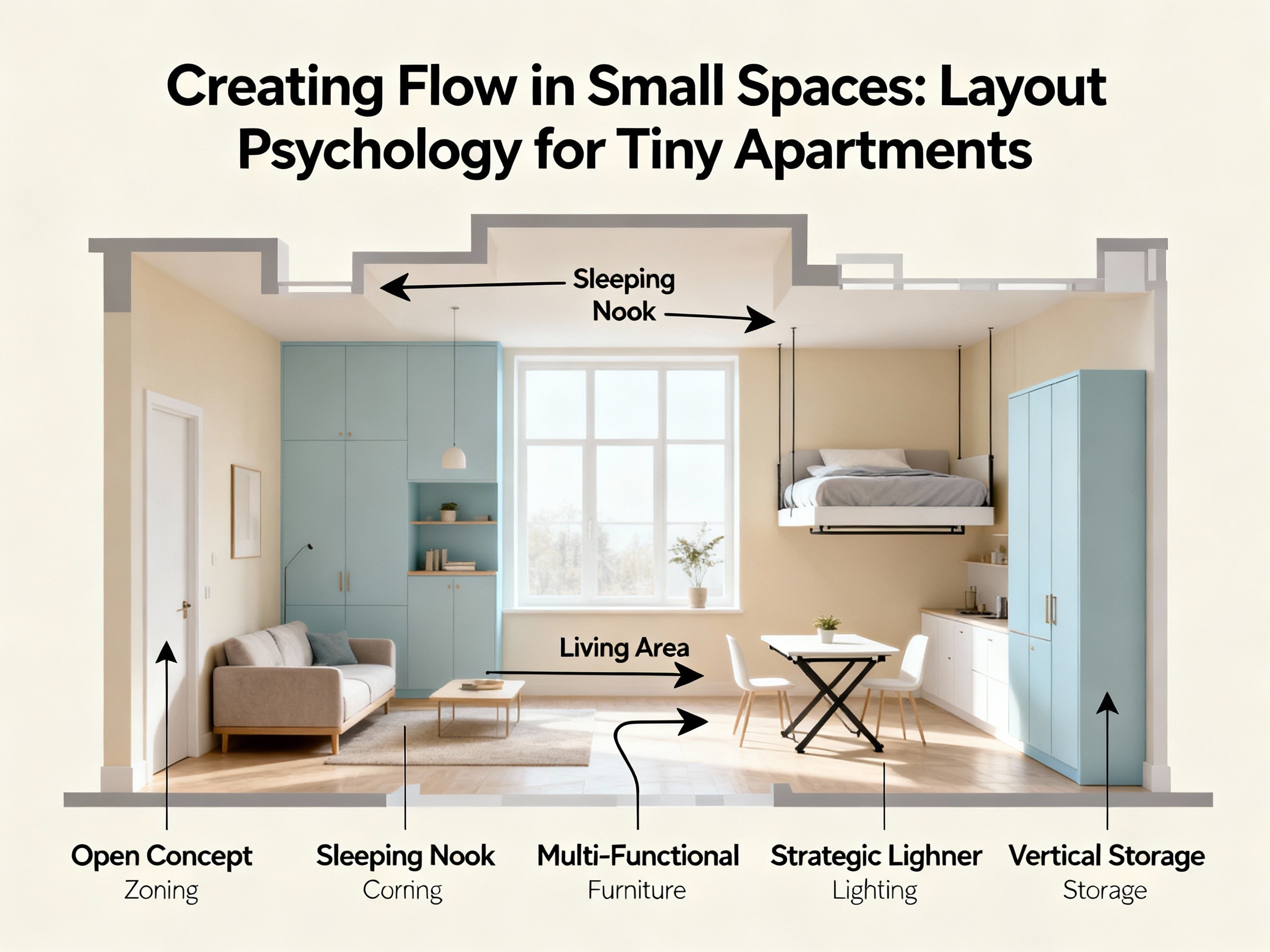
Studio Apartments: Creating Zones in Open Space
Studio apartments present the particular challenge of fitting sleeping, living, working, and often dining functions into one room while maintaining good flow and psychological separation between activities. The key to successful studio layout involves creating implied zones using furniture placement and visual cues rather than actual barriers. Start by identifying which corner or wall works best for your bed, usually choosing a location away from the entrance and ideally tucked into a corner for a sense of enclosure. Position the bed with its headboard against the wall to minimize its floor footprint. If possible, create a shallow zone suggestion using a narrow open bookshelf perpendicular to the foot of the bed, extending just far enough to signal boundary without blocking sightlines completely.
For the living area, position your seating to face away from the bed if possible, creating psychological separation between sleeping and waking zones. Place your sofa or seating along a wall or under a window rather than floating it in the center of the room, which would interrupt flow. Use a rug to define the living zone as distinct from the sleeping zone. If you need a workspace, consider whether you can incorporate it into a multi-purpose area, perhaps using your dining table as a desk or creating a compact work nook near a window. The goal throughout is to establish clear functional zones that feel distinct without using barriers that would chop up the visual space. Think about how someone entering your studio would understand the different areas through furniture arrangement and visual cues rather than through walls or curtains that would make the limited square footage feel even smaller.
One-Bedroom Apartments: Maximizing the Living Space
With a one-bedroom apartment, you have the luxury of a separate sleeping area, which means your main living space can focus entirely on living, dining, and working functions without accommodating a bed. This separation makes flow easier to achieve, but you still need to be thoughtful about arrangement to avoid cramped feelings. The most common mistake in one-bedroom apartments involves trying to cram too much furniture into the living room because you feel you should have a full complement of seating, entertainment furniture, and storage even though the actual square footage cannot comfortably accommodate all of it. Resist this temptation. Better to have a loveseat, one chair, and clear flow than to squeeze in a full sofa set that leaves no comfortable pathway.
Think about your actual lifestyle needs rather than what you think a living room should contain. If you work from home, a dedicated desk area might be more valuable than maximal seating. If you eat most meals at home, a proper dining table even if small deserves priority over other furniture. If you rarely entertain large groups, you do not need seating for six people. Once you have identified your true priorities, arrange furniture to support those functions while preserving clear pathways and sightlines. Place larger pieces against walls to maximize floor space in the center of the room. Use multi-functional furniture where possible, like an ottoman that provides both storage and extra seating, or a console table that can serve as both entry organization and occasional dining surface. Keep the pathway from your entrance through to your bedroom clear and at least thirty-six inches wide, as this represents your primary daily circulation route.
Awkward Layouts: Working With Difficult Architecture
Some small apartments come with challenging architectural features like oddly placed columns, non-rectangular rooms, too many doorways, or other quirks that make standard furniture arrangements impossible. These spaces require creative problem-solving that works with the architecture rather than fighting against it. Start by accepting the quirky features rather than wishing your space were different. That column in the middle of your studio cannot be removed, so how can you use it to your advantage, perhaps as an anchor point for a partial room divider or as a visual feature you emphasize with lighting? That awkward alcove is not going away, so can it become a cozy reading nook or compact workspace rather than dead space you wish did not exist?
For non-rectangular spaces, resist the urge to force rectangular furniture arrangements that fight the room’s shape. Instead, let your furniture placement follow the angles and curves of the architecture. Diagonal arrangements can work beautifully in oddly shaped rooms, creating dynamic visual interest while accommodating the space’s natural geometry. In rooms with many doorways that limit wall space, focus on creating a strong center, perhaps with a distinctive rug and centrally placed furniture that makes the multiple doorways feel like they radiate from a coherent focal point rather than creating chaos. The key principle for difficult layouts involves acceptance and creativity rather than frustration and compromise. Your unusual space has character that standard boxes lack. Learning to work with its quirks rather than against them often leads to more interesting and personal results than you would achieve in a perfectly regular space.
Common Mistakes and How to Avoid Them
Even when people understand the principles of creating flow, certain common mistakes can undermine their efforts. Let me walk you through the most frequent problems I see in small space design so you can recognize and avoid them in your own space. Often, just eliminating one or two of these issues can dramatically improve how your space feels without requiring major changes or expenses.
The Too-Big Furniture Trap
This is the single most common mistake people make in small spaces, and it happens because furniture stores primarily stock and display furniture scaled for average or larger homes. When you see a sofa in a spacious showroom, it might look reasonable, but when you get it home to your small apartment, it completely dominates the space and destroys flow. The solution requires discipline and careful measurement before purchasing. Measure your space carefully, then measure the furniture you are considering. Use tape on your floor to mark out the exact footprint the piece would occupy, including the space needed around it for comfortable use. Look at the proportions. If a piece would occupy more than half of your available wall length, it is probably too large. If it would leave less than thirty-six inches of pathway on any side, it is definitely too large. Better to have a smaller piece that fits comfortably than a larger piece that technically fits but makes your space feel cramped.
Blocking the Window
Natural light is precious in small spaces because it makes them feel larger and more pleasant. Yet many people inadvertently block their windows with furniture arrangements that prevent light from penetrating into the room. The most common culprit is placing a bed or sofa directly in front of a window, particularly if the furniture has a tall back that interrupts the window opening. While there are situations where window placement leaves no alternative, try to keep windows as unobstructed as possible. If furniture must go near a window, use low-profile pieces that allow light to flow over them, or position furniture to the side of the window rather than directly in front. Use light, airy window treatments like sheer curtains that provide privacy while still admitting light, rather than heavy drapes that block light even when open. Your windows are valuable resources for both light and views that make your space feel connected to the outside. Protecting access to these resources should be a priority in your layout decisions.
Neglecting Vertical Space
When floor space is limited, the walls offer valuable territory for storage and organization that keeps clutter off the floor and preserves flow. Yet many people fail to use their vertical space effectively, leaving walls bare while their floors and surfaces overflow with stuff. Think about what could move from floor or furniture surfaces to walls through shelving, hooks, or wall-mounted storage. Books could move from floor stacks to wall shelves. Coats could hang on wall hooks rather than piling on chairs. Kitchen items could live on wall-mounted racks rather than cluttering counters. This vertical strategy works especially well for items you use regularly, keeping them visible and accessible while freeing floor space. Just remember to keep vertical storage organized and not overloaded, as crowded wall storage can create visual clutter even while solving practical storage problems. The goal is using vertical space thoughtfully, not just cramming everything onto walls regardless of how it looks.
“A room should never allow the eye to settle in one place. It should smile at you and create fantasy.” This wisdom from designer Juan Montoya captures the essence of good spatial flow. Your small space should guide your eye and body through it comfortably, creating a sense of possibility rather than confinement, spaciousness rather than cramping.
Implementing Changes: Your Action Plan
Now that you understand the principles and specific strategies for creating flow in small spaces, you might be feeling overwhelmed by the amount of information and wondering where to actually begin. Let me help you create a practical action plan for improving your space that breaks the process into manageable steps. You do not need to implement everything at once. In fact, I recommend making changes gradually so you can observe what works and what does not before committing to major investments or irreversible decisions.
Start by spending a week really observing your current space using the analysis framework I described earlier. Map your movement patterns, identify friction points, notice your visual anchor points, and think about what currently works versus what frustrates you. This observation period costs nothing but provides invaluable information about your specific situation and priorities. Based on what you discover, make a list of the top three issues that most negatively impact your daily experience. Perhaps your pathway from entrance to bedroom is too narrow. Perhaps your seating area feels cramped because the sofa is too large. Perhaps you have no defined workspace and end up working uncomfortably from your couch. These top issues become your first priorities for change.
Address your top priorities one at a time, starting with changes that require no purchasing or major effort. Can you improve a pathway simply by moving existing furniture a few feet? Can you create better visual flow by decluttering a surface or rearranging objects? Make these zero-cost improvements first and live with them for a week or two before moving to changes that require investment. This patient approach helps you avoid buying furniture or making expensive changes that you later regret. Once you have addressed your top priorities and allowed time to observe the results, you can move to secondary improvements or refinements. This might be the stage where you invest in a properly scaled piece of furniture to replace one that is too large, or where you add lighting to create better layering, or where you paint to brighten your space. Throughout this process, keep referring back to the principles we discussed rather than just copying specific arrangements. Your goal is understanding the why behind recommendations so you can adapt strategies to your unique space and needs.
Creating good flow in a small space is not about following rigid rules or achieving some perfect arrangement that you see in magazines. Rather, it is about understanding how spatial perception works in your brain and using that knowledge to make thoughtful decisions that help your limited square footage feel as spacious and comfortable as possible. The most successful small spaces reflect their occupants’ specific needs and personalities while applying these underlying principles in creative and personal ways. Your space should work for how you actually live, supporting your daily activities and reflecting your aesthetic preferences, all while maintaining the visual and physical flow that makes small space living pleasant rather than oppressive. With patience, observation, and application of these principles, you can transform even the tiniest apartment into a space that feels surprisingly livable and genuinely comfortable.